Kaleidoscope
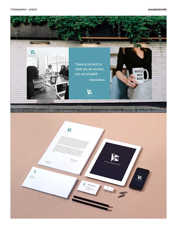
The Kaleidoscope logo is a powerful representation of its mission and values. Inspired by the strength and influence of six remarkable women, the logo cleverly utilizes six triangles to form the letter "K." The triangle, renowned for its inherent strength, symbolizes the resilience and determination of these leaders.
Incorporating a harmonious blend of blue and green, the logo exudes a sense of security and stability. These colors not only evoke trust but also underscore Kaleidoscope's commitment to empowering women and providing invaluable business guidance.
The choice of the Roboto font reinforces the brand's identity as clean, modern, friendly, and humanistic. This logo encapsulates the essence of Kaleidoscope—a beacon of leadership, empowerment, and support for women on their journey towards success.
My Responsibilities:
Logo Design


