Jane Bakes (Rebranding)
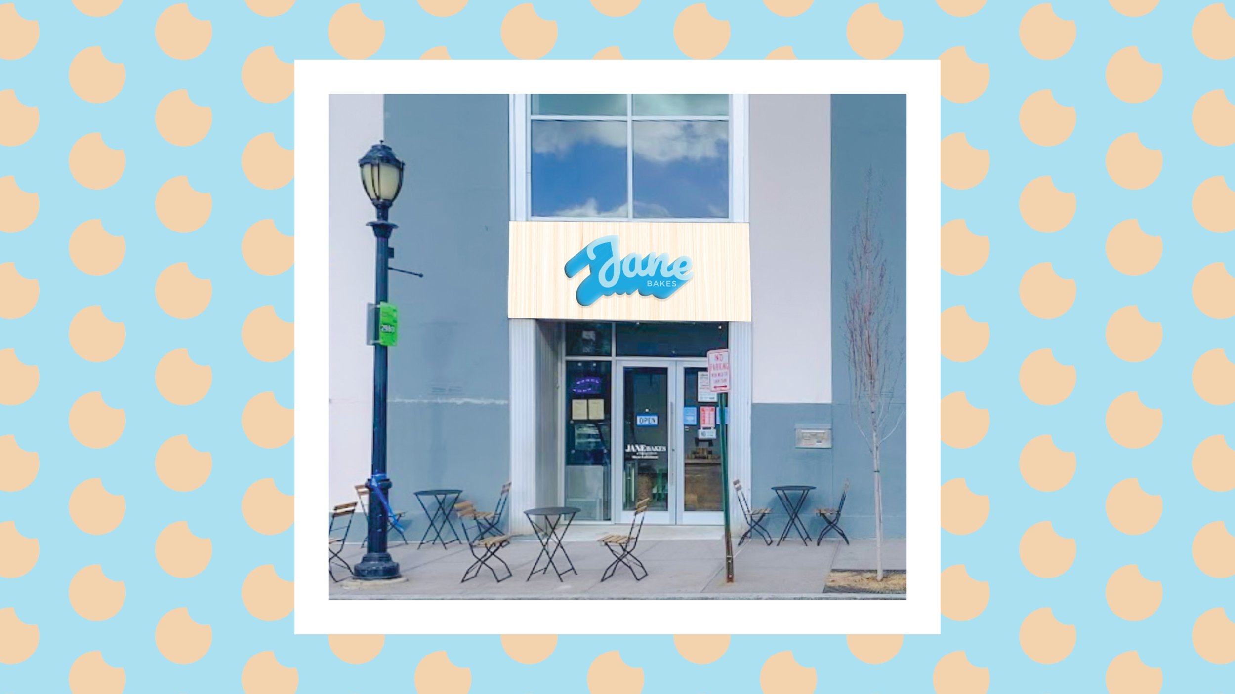
Jane Bakes is located in the center of Yonkers, NY. Housed right beside the Post Office, DMV, and other retail stores, this baked shop is a prime location for both locals and commuters to fill up before their day. It is a place that will now embody characteristics that make it more “human” and fun. This is their home away from home!
My Responsibilities:
Branding
Art Direction
Print Design
Environmental Design

Challenge
With the constraints of having limited facility space, Jane Bakes didn’t feel like it provided a real human experience (but still had exceptional service). They didn’t have the capacity or the seating to welcome or captivate customers with inspiring imagery or branding.
Goal
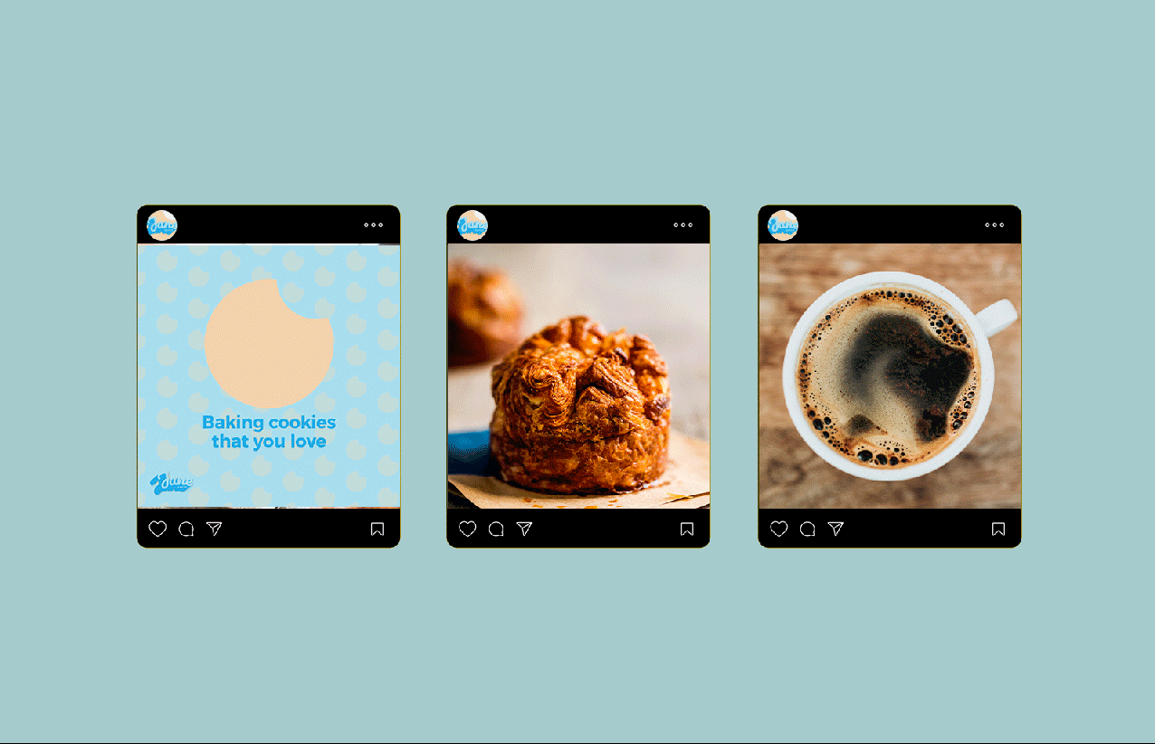
Being relatively new, I wanted to rebrand Jane Bakes and provide a level of consistency through every consumer touchpoint. The first step would be to redesign their logo to something more fun and human. Afterward, I would revisit the consumer journey and see where we can brand ourselves.
Inspiration


The logo stems from a playful background. Rooted within the heart of yonkers, the round and organic type allow the logo to be welcoming and “human.” To reinforce a sense of playfulness and provide additional branding, an icon set placed behind the logo can further extend its meaning and establish variety when it comes to ads and campaigns.