Ceres Circular Market
Ceres is a start-up looking to challenge the way we look at stores like Whole Foods, Shoprite, Target, etc. Many consumers purchase large quantities of food and supplies with little to no thought of its sustainability and effects on our carbon footprint. There have been many initiatives that direct people to a sustainable and eco-friendly lifestyle, but Ceres wants to take those ideas further to better improve our health and planet through commerce.
My Responsibilities:
Brand Identity
Art Direction
Brand Guideline
Print Design

Challenge
With the market becoming saturated with companies and initiatives similar to Ceres, the majority of logos have looked very similar to one another. This company was looking for a brand identity that reflects its mission and values, yet stands out differently from its competitors. Ceres also wanted to reflect its logo toward its target audience — early adopters, eco-friendly/sustainable consumers, and more.
Ceres wants to convey a level of passion and inspire its consumers to challenge the way we purchase goods. These consumers are passionate about the planet and look forward to providing new opportunities for curious consumers. They strive to do their best in carrying the mission toward sustainable solutions and seamless services for consumers throughout their journey.
Goal
To create a visual identity where people can feel connected to the brand’s values and philosophy. Giving them a fresh experience of how they should shop and live their lives. The goal is to ensure a sense of home and family, where we can be balanced and find alternative solutions to better improve the quality of our purchase decisions.


Design Process
-
Design Research
To create an identity for Ceres, I had found data that best reflects its mission, values, and position. Through my research, I’ve established keywords as a starting point to understand the brand as a general concept and finding an eco-friendly approach. To reinforce these themes, I’ve developed mood boards and looked at other logos that share similar values.

-
Visual Concepts
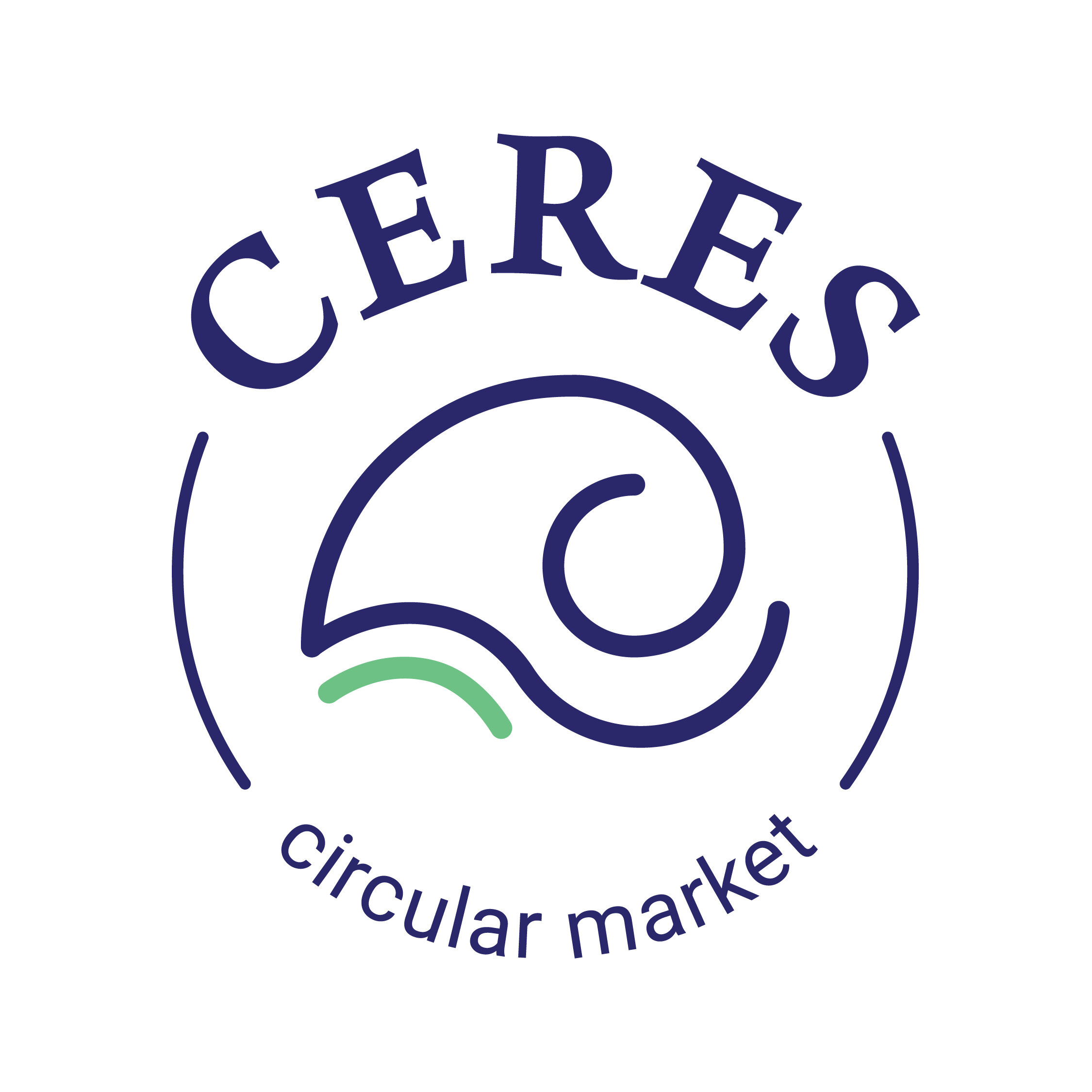
In developing the brand name, the history and identity of Ceres matched well with the company’s values and philosophy. The initial idea for the logo would reflect concepts of nature, balance, harvest, the earth, and the sea.
The name Ceres is from Roman mythology, and she is the equivalent of Demeter, the goddess of agriculture. For many deities, the goddess of agriculture was often depicted with a cornucopia (known for abundance and harvest). This history led to the design of Ceres, a representation of the Cornucopia which bears its meaning and reflects Ceres’s role as a goddess.

-
Sketches
After conducting the design research, I knew I needed to create a linear style logo as a means to use less ink and reduce water consumption. Additionally, I found it best to maintain an organic and round-like characteristic to reflect and communicate back to the brand’s values.
Additionally, I studied various images and illustrations of a cornucopia to help with the initial sketches. While the brand exemplifies the idea of being minimal and sustainable, I continued to minimalize the logo while maintaining the initial design concepts.

Inspiration


